


- Who is the client or the company you’re representing? Canon Inc.
- What is the product? E05 Rebel T8i.
- Who is the target audience? Look no further than Canon’s E05 series if you want the best features, the most durable build quality, and the guarantee that your camera will keep every promise it made.
- Where would you expect to see this advertisement? A digital photography magazine.
- What camera will you use? EOS 5D Mark IV.
- What kind of lighting are you going to use to make this look professional? Strobe lighting.
- What props do you need? One E05 Rebel T8i, One Canon Telephoto lens, One Canon Fixed lens and Canon Camera bag.


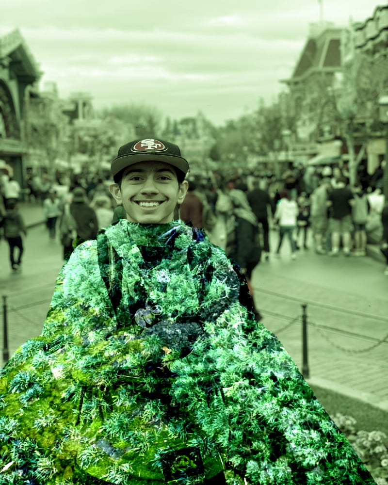


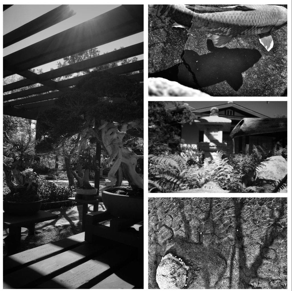
Witnessing how Senior portraits are underdone being a potential high school graduate for the Class of 2021 allowed myself to experiment on the youngest cousin currently in high school. Although being camera-shy, I was able to experiment in different locations at the Japanese Friendship Garden in San Diego, California back in February. With a plentiful amount of trial and errors or limitability due to requirement to continuously move through the pathways, I was able to create two unique senior portraits. For editing, I chose to edit using Snapseed where I had played for countless hours finding a way to use the portrait effects to get started but with the mask on, it could not identify a face. Honestly, I felt that I did pretty well on the first senior portrait activity because although I was rushed in the moment, I was capable of editing the images in the best possible way that has gifted myself a pat on the back.


Sandy Skoglund is a photographer and installation, artist, Skoglund creates surrealist images by building elaborate sets or tableaux, furnishing them with carefully selected colored furniture and other objects, a process of which takes her months to complete. Sandy Skoglund suggest through her work that humans are interfering with natural forces such as radiation, pollution, global warming, loss of habitat which are destroying the Earth. Sandy Skoglund is able to capture her artistic ventures through her photography and most importantly, she is willing to experiment with different themes. Sandy Skoglund’s photographs appear to be serious, humorous images at first glance, but a closer inspection shows an underlying threat. People’s fears are compounded by this danger. The pictures themselves are very big and have a lot of vibrant colors. Skoglund’s photographs depict the subjects as having an eccentric and surrealistic feel to it. Such a multifaceted photographer with extraordinary depth and substance in both her work and her persona as a colorful and thoughtful individual. “The concept is more critical than the object,” she says, and I love it.


One of Wally Kandinsky’s famous quotes is “Color is the keyboard, the eyes are harmonies, the soul is the piano with many strings. The artist is the hand that plays, touching one key or another, to cause vibrations in the soul,”. Wassily Kandinsky saw potential for abstract art and exploited the interrelation between color and structure to create a sensory experience engaging sight, sound, and emotions of the public. He expressed volumes about his inner experiences through his art. He connected the composition of musical notes in his art through color. His paintings was all about the deep spiritually, conveying a human depth of human emotion through universal language of visual imagery, transcending cultural and physical boundaries. This artwork clarified ideas about modern, non-objective art, particularly the significance of shapes likes triangles and circles.

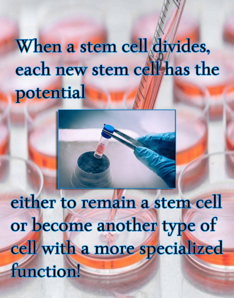
Stem cells have the remarkable potential to develop into many different types of cell types in the body during early life and growth. In addition, in many tissues the serve as a sort of internal repair system, dividing essentially without limit to replenish other cells as long as the person or animal is still alive. Perhaps the most important potential application of human stem cells is the generation of cells and tissues that could be used for cell-based therapies. Today, donated organs and tissues are often used to replace ailing or destroyed tissue, but the need for transplantable tissues and organs far outweighs the available supply. For example, it took two decades to learn how to grow human embryonic stem cells in the laboratory following the development of conditions for growing mouse stem cells. Therefore, understanding the signals in a mature organism that cause a stem cell population to proliferate and remain unspecialized until the cells are needed. The specific factors and conditions that allow stem cells to remain unspecialized are of great interest to scientists. It has taken scientists many years of trial and error to learn to derive and maintain stem cells in the laboratory without spontaneously differentiating into specific cell types.


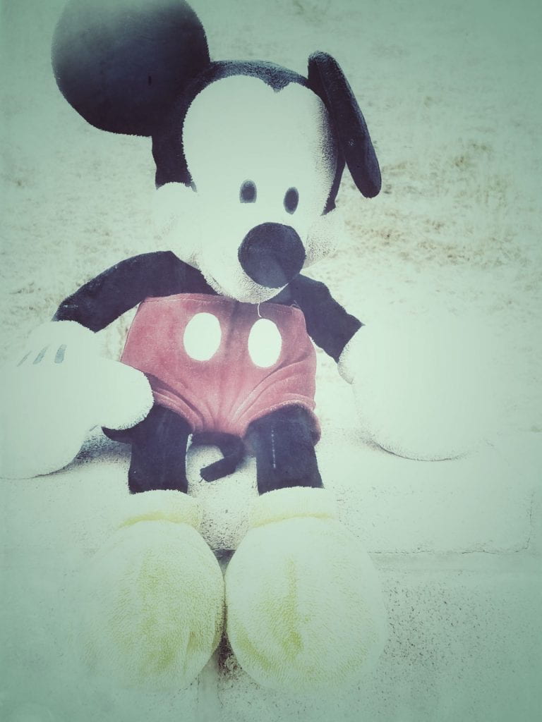
A tintype photograph made by creating a direct positive on a thin sheet of metal coated with a dark lacquer or enamel popular in the last half of the nineteenth century. Also known as a ferrotype. The first step to creating a vintage Tintype Pixlr was to take a head to shoulder self portrait using the Pixlr camera where I had to decide on one effect to have the portrait seem vintage. Here after a countless tries with different effect, I ultimately decided upon the effect titled “Hagrid” where it balanced a few primary colors of black, white, and gray, ironically matching with the sweater I was wearing in the photograph. While lowering the effect’s saturation to 25, I added a numerous amount of borders such as “Old”, “Coloreith”, and “TV” allowing the portrait to seem it was taken in the early 1850’s.